Explorations and inspiration
In our effort to enhance YTB's digital presence, we conducted a thorough competitive analysis of various nonprofit organizations' websites and applications. We were especially inspired by charity: water’s site, notable for its compelling use of powerful imagery and engaging real-life narratives. Their commitment to transparency in donation usage significantly contributes to their success in attracting donors. Furthermore, we admired the simplistic design of Anak Alam Learning House's website, which we frequently referenced for our landing page design. For the app, we primarily focused our analysis on the gamification element, compiling diverse strategies to enhance youth member engagement.
USER RESEARCH
Challenges
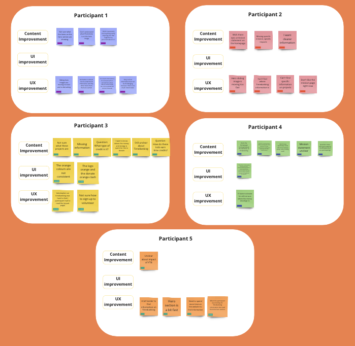
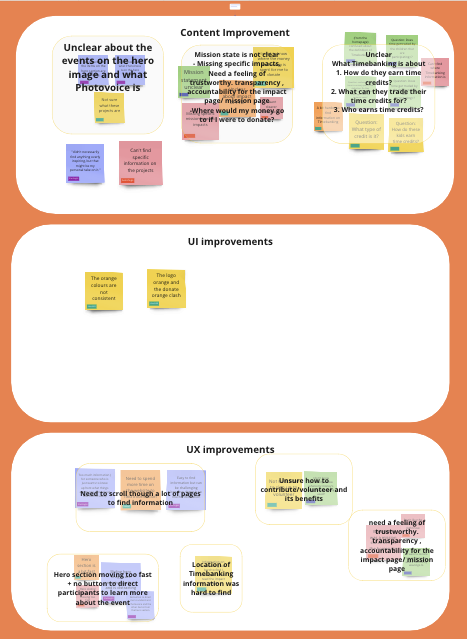
Brief insights and data from 4 usability tests on the old website
Clarifying who our product is for
We undertook a thorough process to identify and understand our users, whom we referred to as YTB partners. These partners include YTB Sponsors, YTB Collaborators, and YTB Participants, each with unique characteristics and needs. With subcategories like YTB Ambassadors and Leaders/Cross-Age Coaches
IDEATION
Sitemap and Information Hierarchy
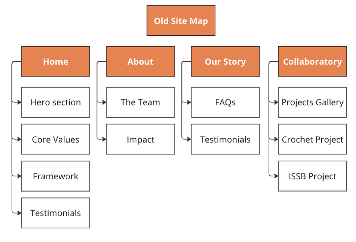
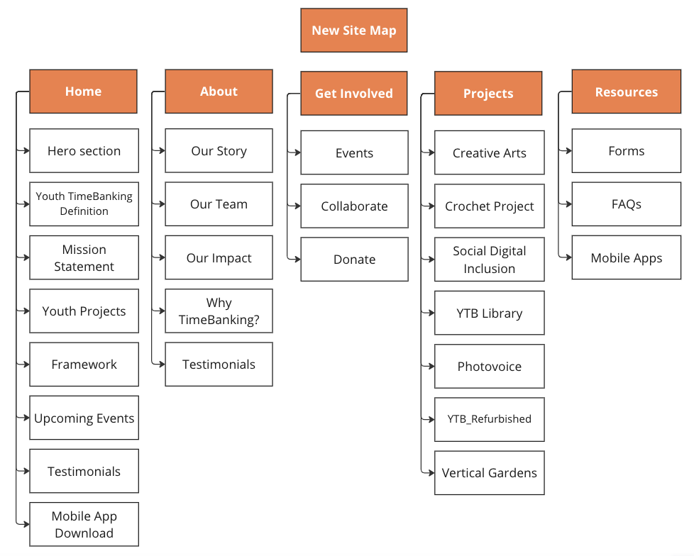
We conducted tree testing with 25 users, who performed tasks using the website after its first round of implementations to analyze the information architecture of the website. We discovered that users had trouble navigating through the pages of the website and experienced confusion regarding what information was available on which page.
APP
Mid to High-Fidelity Development
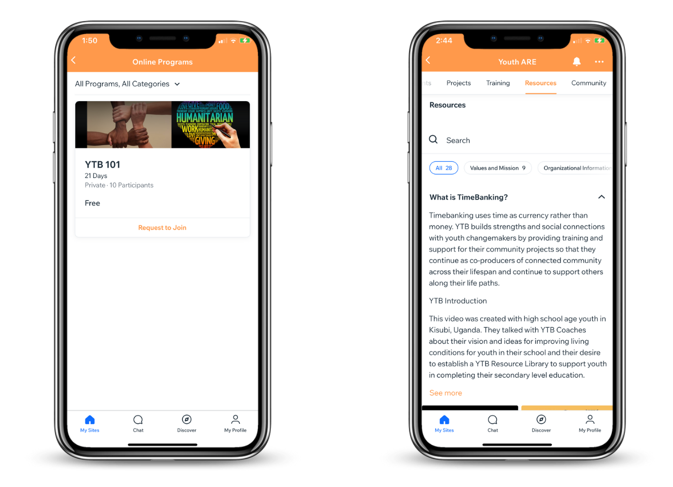
For a little bit of context, our app was powered through WIX Spaces and ha a regular subscription, meaning we had a limited number features and visual elements that we could implement to fulfill our client's needs, in this process we did not have full knowledge or experience with the features we investigated as we were creating our PRD. Due to this we started creating directly on WIX spaces communication with the client was key in this process as we as informed them of any unexpected changes that had to me made or new discoveries.
During this process we also had to brainstorm some workarounds to accomplish our client's needs. A few aspects that we had to rethink and adjust accordingly:
Community engagement:
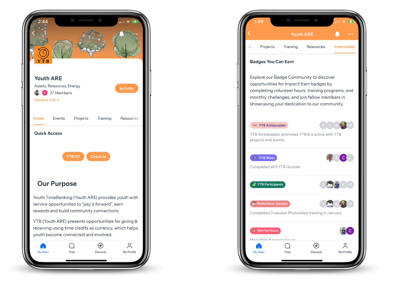
-As we discussed since the beginning, we wanted to include badges to encourage others to participate, this was actually possible and then through this we found out we could make certain pages only visible to people with specific badges, allowing us to manage the different profiles between youth and leaders without having to give them access to edit the website.
-As a future step we also found out we could automate the badges given out, by managing them through the forms that youth submit when an activity is completed.
Profile in the app's main navigation bar:
-We couldn't edit the profile to make it appear in he navigation as the client wanted but we were able to create a community badge catalogue.
-Seeing what else they can earn and how? As participants are not able to see other's profiles they can still explore the badges that people using the app have earned, the number of people that have them and how to earn them.
They
WEBSITE
Low-Fidelity Wireframes
We visualized the layout of various pages and their subpages, including the Landing page, About page, Contact Us page, and Projects page.
Mid-Fidelity Wireframes
After receiving feedback from our client on the lo-fi wireframes, we implemented the changes in our creation of the mid-fidelity wireframes on Figma. We applied our design system and went into depth with the specific content and layout of each page. Some of our changes made after meeting with the client were mostly related to information architecture, content summarization and paraphrasing.
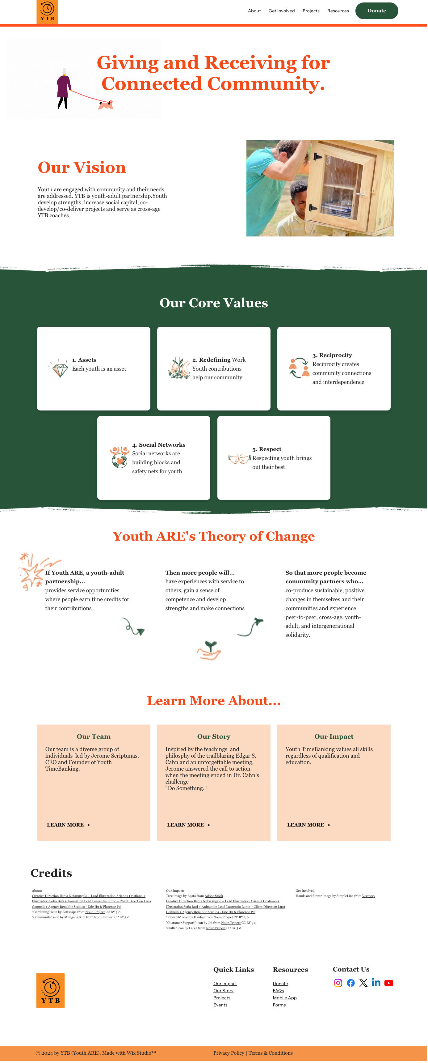
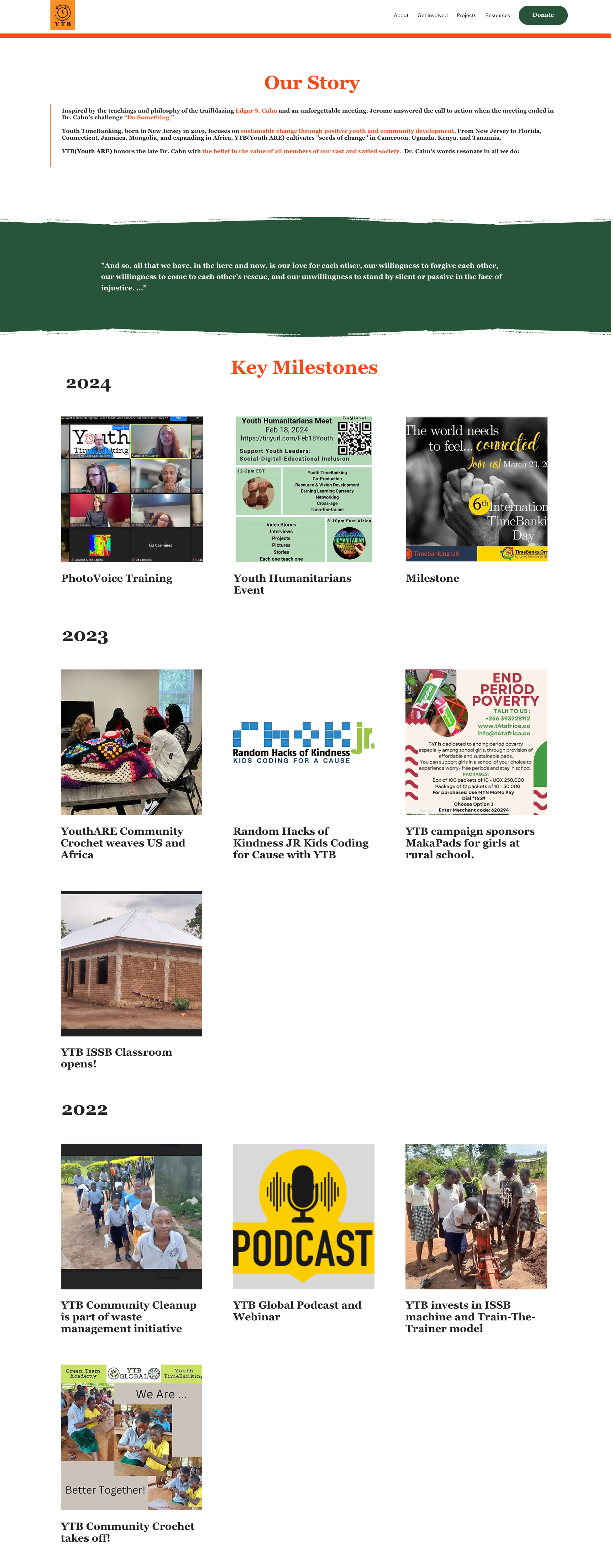
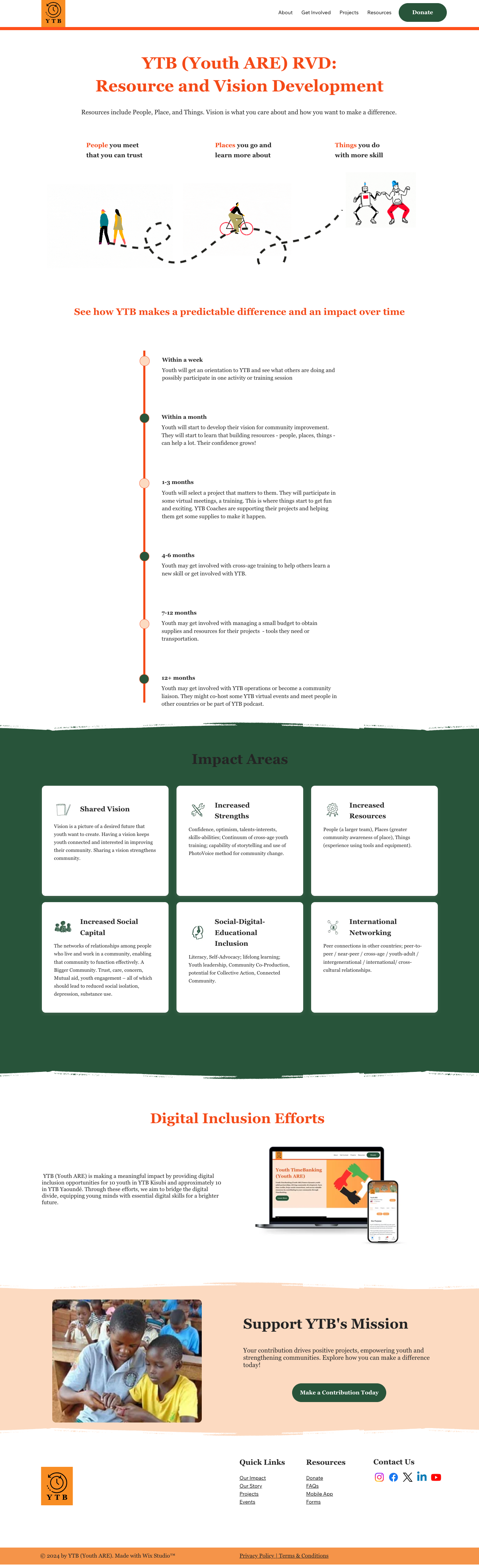
For instance, one of the pages that was reviewed and revisited in the redesign process was "Our Impact" page. In this case we wanted user's to be able to get a better idea of the difference that participating in this initiative makes. In this process one of the most remarkable clarifications that the client wanted to make was that Youth involved with timebanking benefit in many ways. They build strengths, experience a larger community, have opportunities to meet people, visit places, and use tools and equipment. They develop critical thinking skills, teamwork, responsibility, accountability, vision, confidence, optimism.
.png)
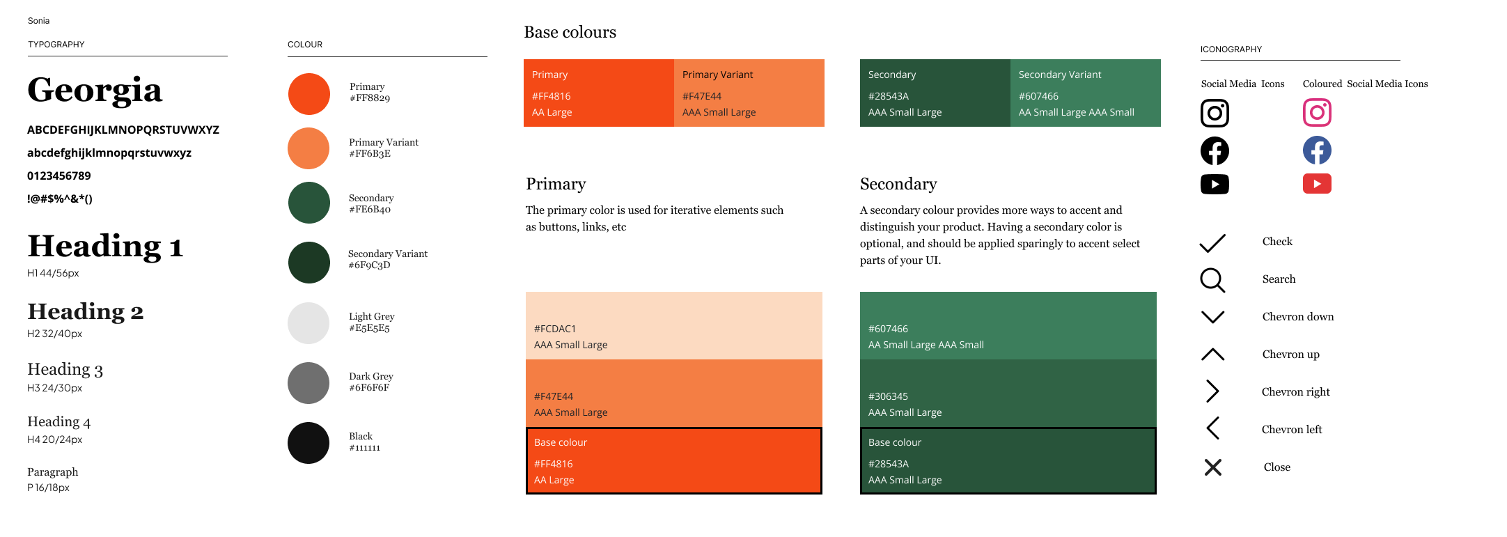
Brand Identity
We updated YTB's branding colors, choosing orange and green to symbolize growth and change. This updated palette resonates with YTB's message that Youth ARE: Assets, Resources, Energy. Implementing the Georgia font for headings and body text further elevates the website's modern aesthetic, ensuring a seamless and visually appealing user experience across all platforms.
For our final design, we translated our mid-fidelity wireframes onto Wix. We then requested content from our client, who provided us with proper information and additional content (videos, pictures, etc.). We then conducted a series of user testings (described below), which helped us identify problem areas. We used this information, alongside the feedback from our client to implement the necessary changes, thus producing our finalized website.
ITERATION
Usability Testing Insights
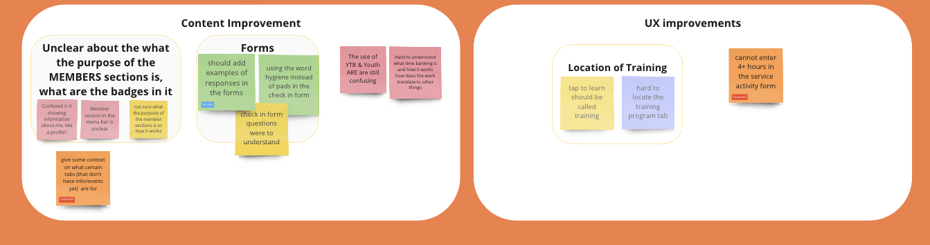
App
We tested our prototype with 4 YTB members to receive feedback and discover areas for improvement. After user testing, we analyzed the results and narrowed down key insights. From the user testing results, we realized that our tabs needed more context and improvement on the titles. We discovered that some of the questions in the forms needed to be more concise and simplified. Most importantly we found that we needed to improve the communication of what the non-profit does and how it is organized. These insights helped to improve the structuring, flow, and clarity of our designs.
Website
After implementing our design onto Wix, we carried out 3 series of user testing, surveying a total of 15 users to gather feedback and identify areas for improvement.
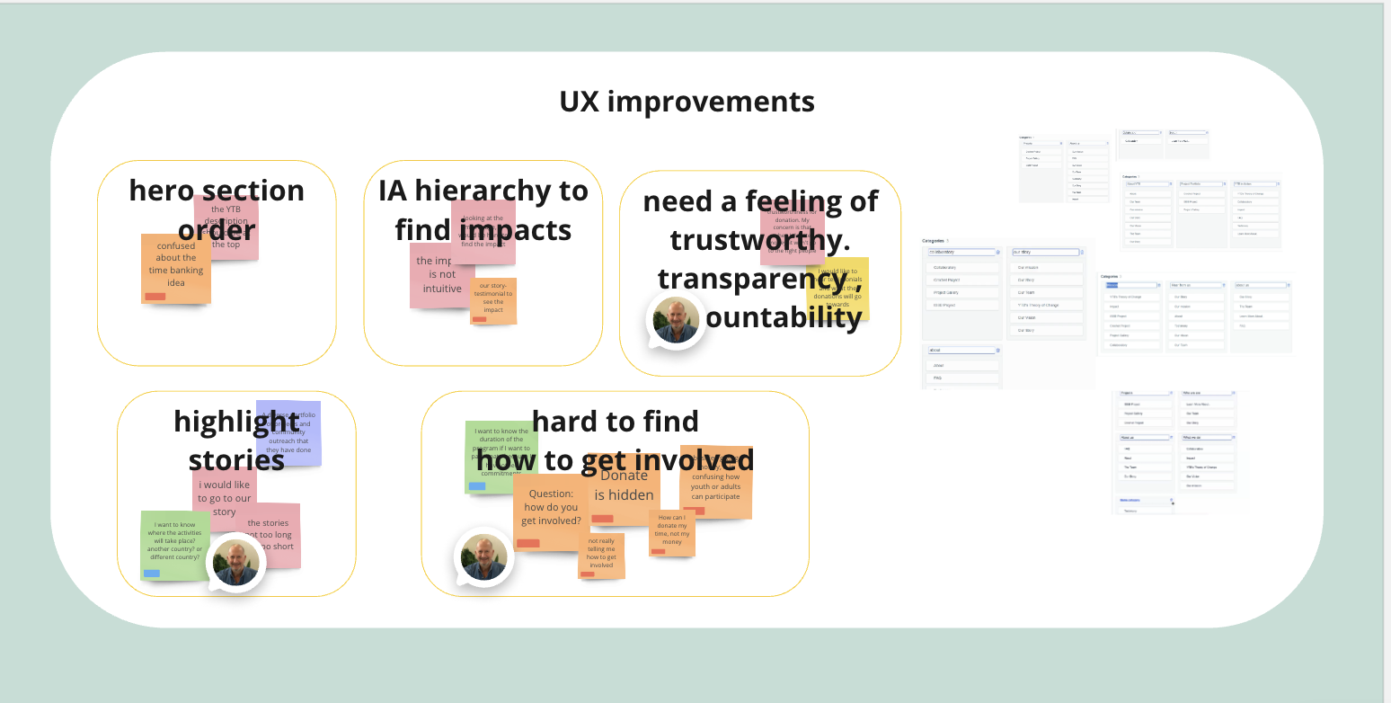
Round 1: General Website User Tests
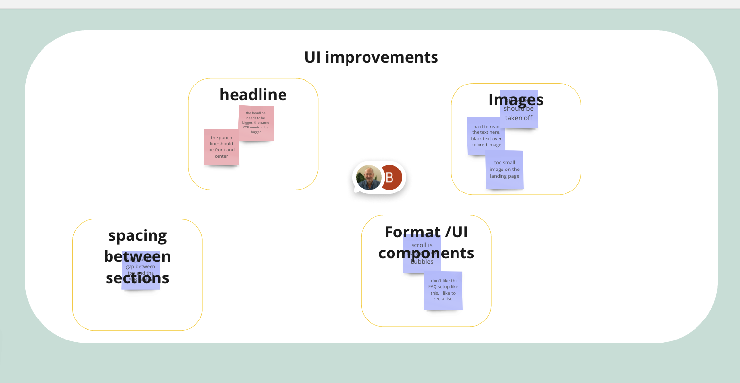
In order to gain deeper insights into potential issues and evaluate users' interactions with the website, we first conducted 5 user tests. Several common themes emerged from these tests:
- Difficulty understand the definition of TimeBanking
- Unable to understand YTB (Youth ARE)’s mission and impact
- Pages had too much information and were text-heavy
Round 2: A/B Comprehension Test on ‘Impact’ Page
The team conducted another round of user tests to determine if the ‘Impact’ Page would be more impactful if it contained quantitative data, rather than qualitative. We set up one set of user tests on 5 individuals so that they could only see the ‘Impact’ page with quantitative data, and another set of test on 5 additional individuals who could only see the qualitative information. We then determined from the results that the qualitative page was more successful in conveying impact, however, we decided to refine and specify the ‘Impact Areas’ section as requested by users.
Round 3: New ‘Why Youth TimeBanking?’ Page
Taking the Round 1 test feedback into consideration, we focused our efforts on resolving these key issues. Recognizing the need for clarity on TimeBanking and YTB’s Impact, our team created a new page to define them and updated the Impact page accordingly. We then conducted 5 user tests on this newly created TimeBanking page. The overall results of these tests concluded that the graphics on the Impact page and the TimeBanking page effectively communicated YTB’s mission and Impact, and their vision.
.jpg)